
Project № 14
Deutsche Bank
Customer Portfolio Overview — a responsive advisory workbench for the wealth management desk.
This case study is gated. Enter the access key to view Deutsche Bank in full. Access persists for the rest of this session.
Customer Portfolio Overview — a responsive advisory workbench for the wealth management desk.
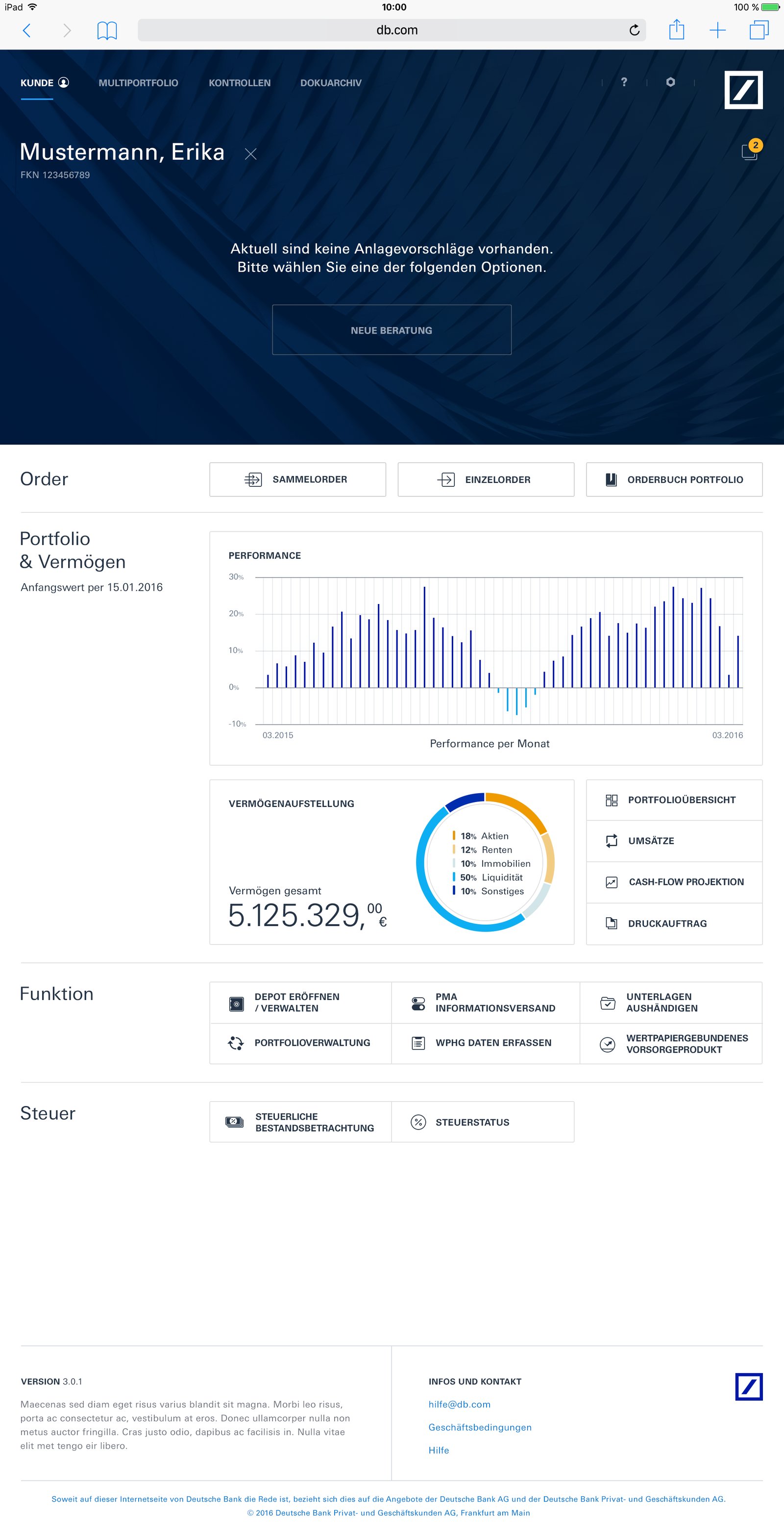
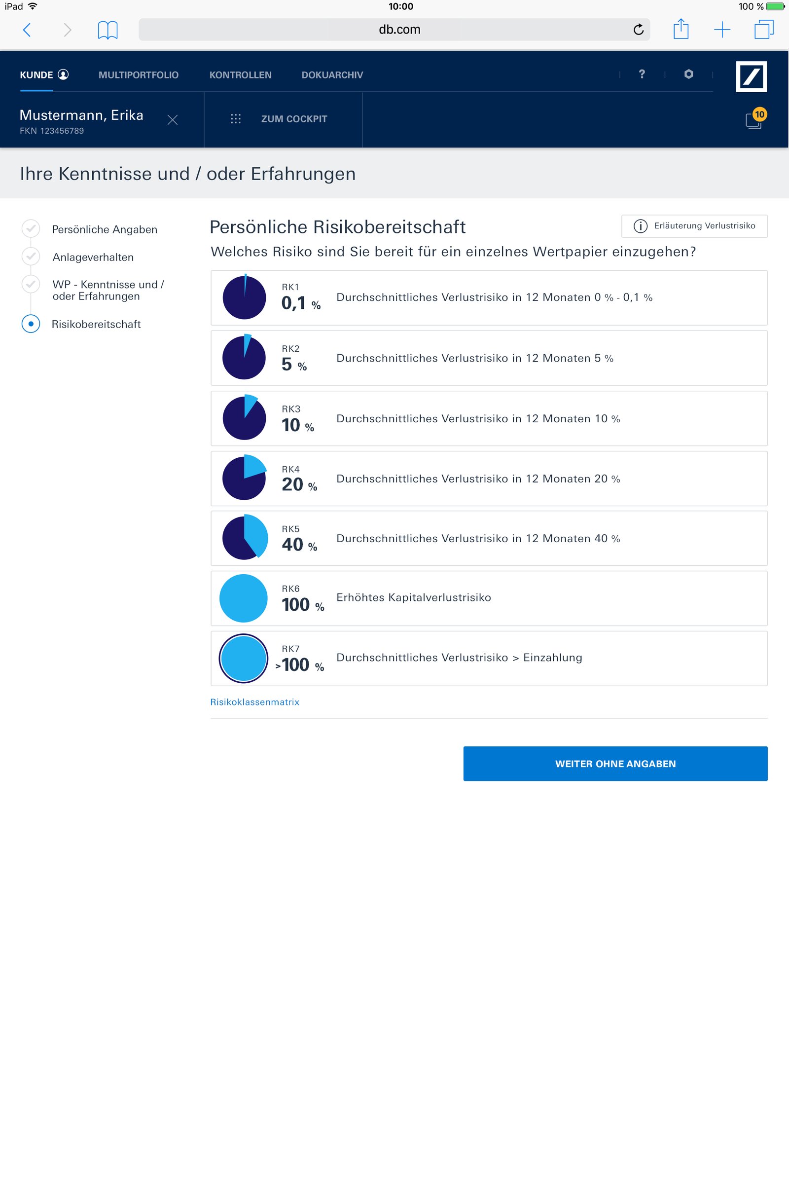
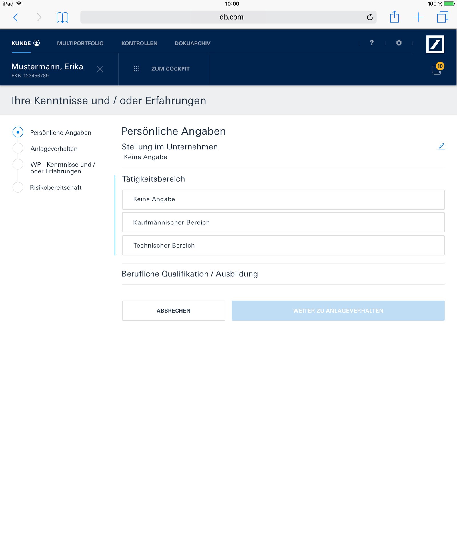
The Customer Portfolio Overview (CPO) is the advisory workbench Deutsche Bank wealth advisors use in front of a client. Portfolio visualisation, risk assessment, personalised investment recommendations, regulatory reporting — the whole advisory conversation lives on this one surface.
I joined via HCL Technologies as Lead UI Designer, providing design leadership and management for the CPO application and the team building it. A multidisciplinary group of 10+ — UI designers, UX designers, researchers and developers — distributed across London, Frankfurt and Noida.
Wealth management is one of the few financial services where the advisor still sits next to the client — the iPad on the desk, the portfolio on the screen, a conversation about goals and risk. The previous tool forced the advisor into desktop-only workflows, broken by dense tables and static charts that could not be touched, sorted, or reshaped mid-conversation.
The CPO redesign had to deliver something that felt tactile on iPad and substantial on desktop, without maintaining two diverging codebases. It had to match Deutsche Bank's central Design Styleguides — the bank's internal standards — without letting that constraint strip away the dynamism the advisory role actually needs.
The organisational challenge was just as real. The team spanned three countries, three timezones, and three cultural approaches to design review. My job was to hold the design language consistent across all of that while travelling repeatedly to Frankfurt to lead the on-site team.
Led a multidisciplinary team of 10+ designers, researchers and developers across London, Frankfurt and Noida — reviews, critiques, design direction, escalation path for the CPO programme.
Designed a UI optimised for both iPad and desktop, with the same underlying component system. The iPad view prioritised touch and tactile reshaping; the desktop view prioritised density and precision. Same language, different affordances.
Portfolio visualisation with dynamic dashboards, risk assessment tools for personalised investment strategies, and compliance and reporting modules that satisfied regulator requirements without getting in the advisor's way.
Held the design honest against Deutsche Bank's Design Styleguides — the central bank-wide standards — while travelling to Frankfurt to align the on-site team with the London & Noida remote work.
Wealth management is still done face-to-face. The tool on the desk is the third party in every conversation. — CPO design principle
Selected frames from the Customer Portfolio Overview — dashboards, risk assessment, portfolio visualisation, reporting.


Qualitative outcomes — the product serves a regulated environment where public metrics aren't disclosed.
The CPO engagement taught me what design leadership actually is when the team isn't in the room. It is less about pen on the page and more about frameworks that travel — design tokens, written principles, reviewable rationale. The London & Noida teams had to be able to make the right call without me in their timezone, and the Frankfurt on-site work had to stay in rhythm with both.
The CPO was praised for its sleek design and usability. What I'm proudest of is that the team behind it could ship confidently from anywhere.