
Project No 01a
Self-Registration
Competitive UX audit of 8 translation platforms — from research to redesign.
This case study is gated. Enter the access key to view Acolad Self-Registration in full. Access persists for the rest of this session.
Competitive UX audit of 8 translation platforms — from research to redesign.
Acolad needed to redesign its self-registration flow to convert more clients. The existing onboarding was enterprise-heavy with too many steps, and the team lacked evidence of what competitors did well and where they failed.
I led a competitive UX audit of 8 translation platforms, recording video walkthroughs with narrated observations for each. The research produced full .vtt transcripts, a cross-platform friction map, and directly informed 27 wireframe iterations across 7 version branches — from core registration architecture through pricing models, enterprise workflows, and progressive disclosure.
Self-registration is the first touchpoint for new clients. Get it wrong and they leave. Acolad's existing flow was enterprise-heavy with too many steps — verification layers, form fields, and decision points that made sense internally but created friction for first-time users.
The team needed evidence of what competitors did well and where they failed. Not opinions — documented, narrated, replayable evidence that stakeholders could reference throughout the design process.
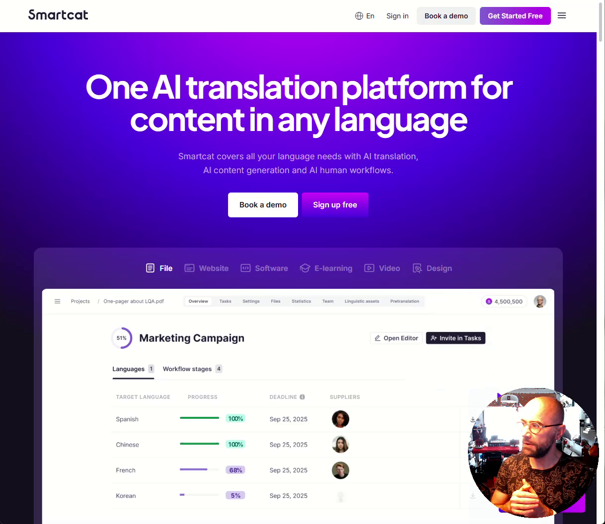
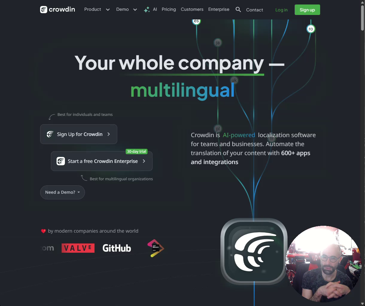
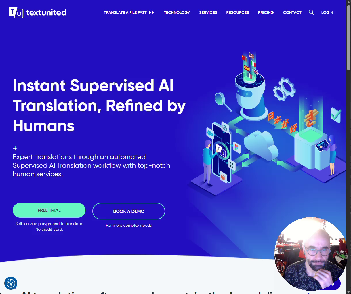
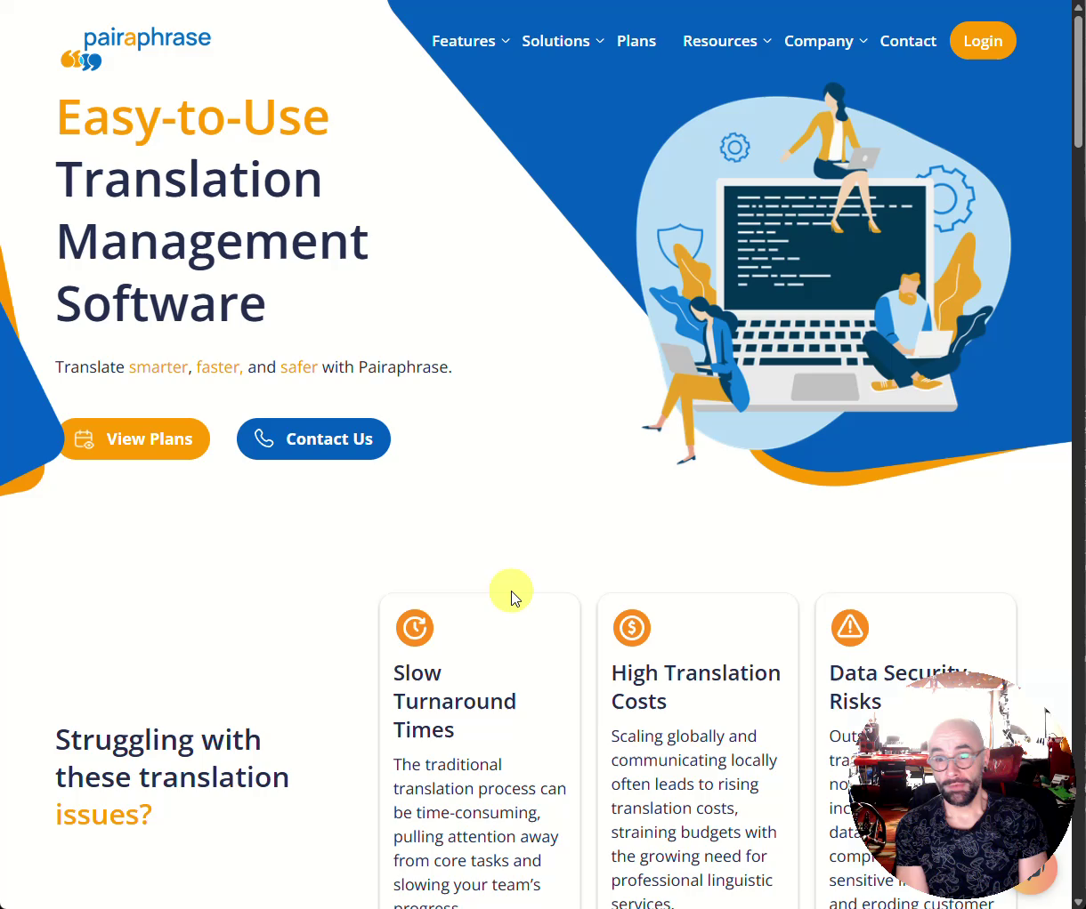
The 8 platforms ranged from lightweight (Pairaphrase) to comprehensive (SmartCat). Each had different onboarding philosophies — some quote-driven, some self-serve, some requiring multi-step email verification before any value was delivered.
The challenge was extracting universal patterns from diverse approaches: what streamlined registration actually looks like, where enterprise requirements create unavoidable friction, and how the best platforms balance thoroughness with speed.
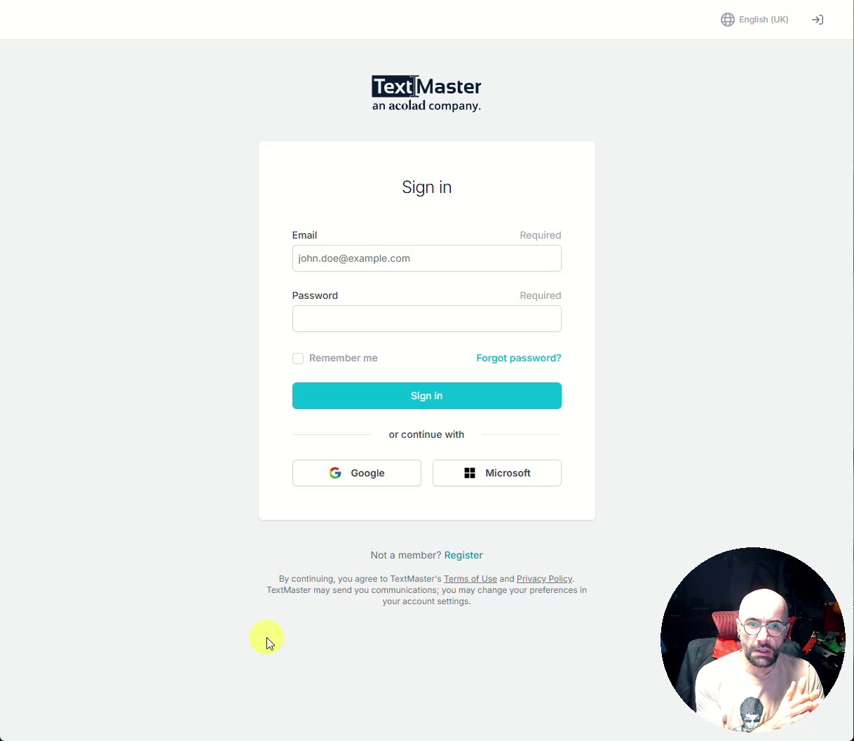
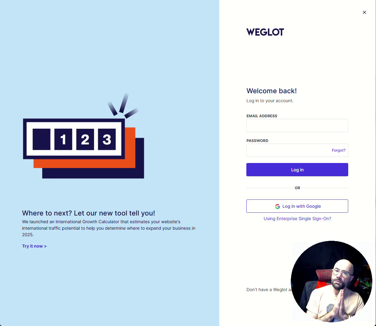
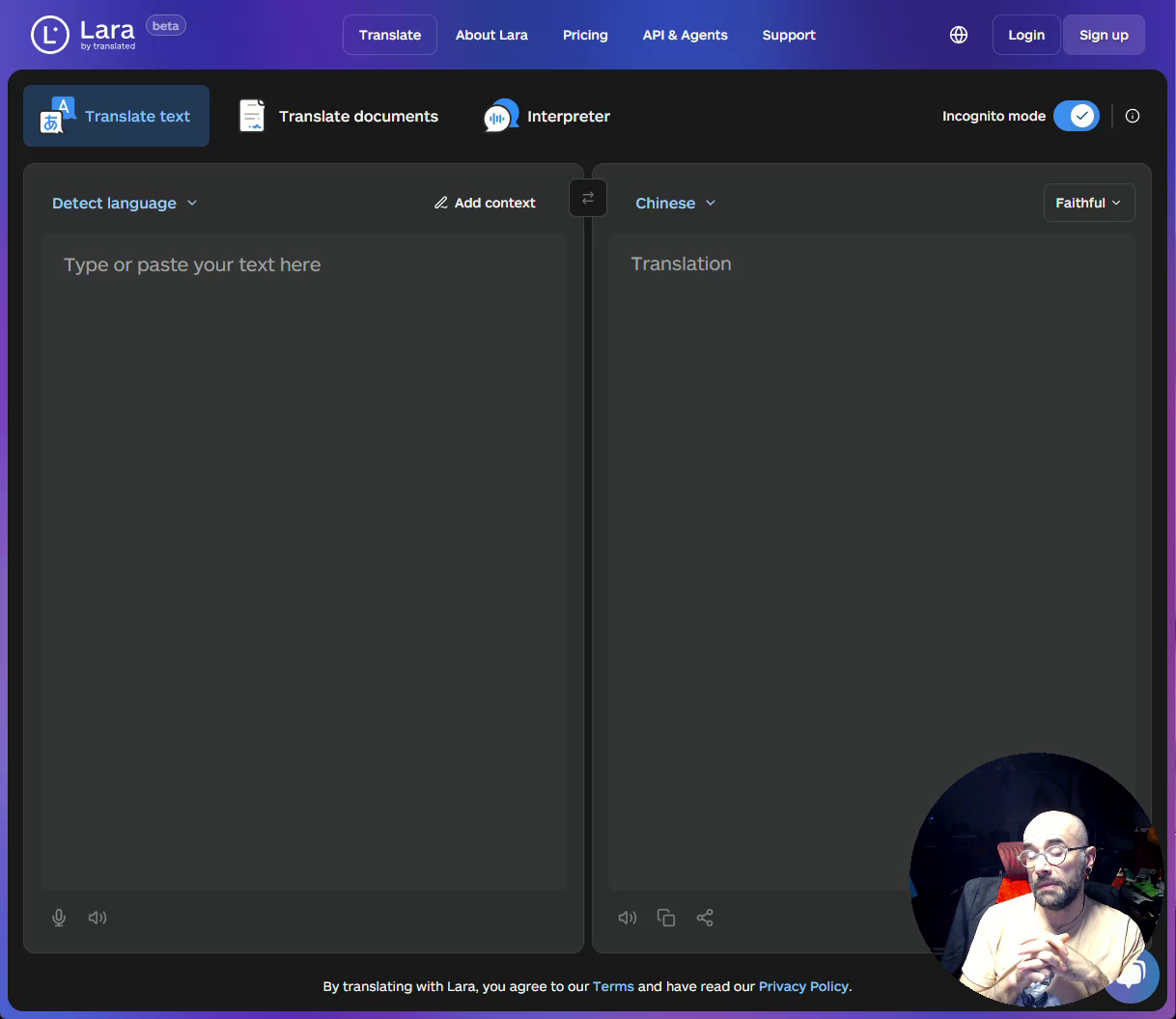
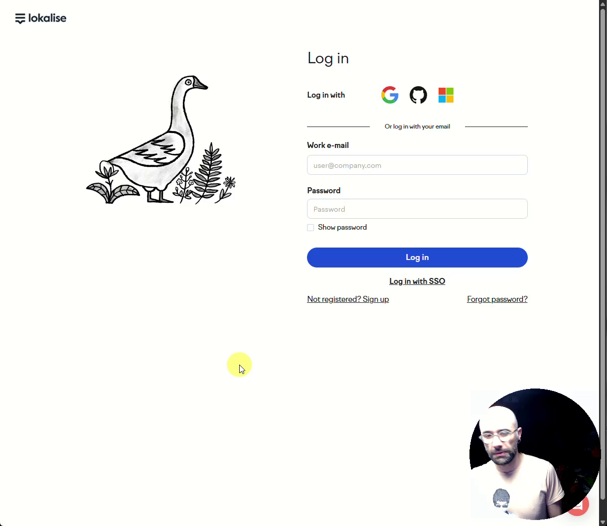
Recorded video walkthroughs of 8 competitor self-registration flows — TextMaster, Weglot, LarabyTranslated, Lokalise, SmartCat, Crowdin, TextUnited, and Pairaphrase. Each session narrated in real-time with usability observations. Full .vtt transcripts generated for every platform.
Mapped friction points, drop-off risks, and best practices across all 8 platforms. Identified patterns: streamlined vs enterprise-heavy, quote-driven vs self-serve, single-step vs multi-step verification. Built a cross-platform comparison framework covering registration, onboarding, billing, and navigation.
27 Figma wireframe iterations through 7 version branches: V1-V9 (core architecture), V3 variants (streamlined registration), V4 Credits (pricing model integration), V5 Quotes (enterprise workflow), V6-V7 (payment integration and progressive disclosure).
Stakeholder reviews at each version branch. Competitive audit findings became the shared reference point for all design decisions — teams could watch a 15-minute walkthrough video and immediately understand why a specific pattern was chosen or rejected.
The goal is to converge towards the best self-registration experience — the whole end-to-end process from registration to first project, payment, billing, and dashboard navigation. — From the competitive audit narration
27 iterations across 7 version branches, each informed by competitive patterns observed across the industry.
Quantitative outputs from a competitive audit that became the foundation for every design decision.
The narrated video walkthrough format was the highest-ROI research method of the entire engagement. Stakeholders could watch a 15-minute video and immediately understand why a design decision was made — no slide deck required, no abstract heuristic scores to interpret. The evidence spoke for itself.
Next time: start the competitive audit earlier, before wireframing begins, and use the friction map as a living document rather than a one-time deliverable. The cross-platform patterns were valuable enough to revisit throughout the design process, but by the time later version branches were underway the audit had become a static reference rather than an evolving tool. A continuously updated friction map — annotated with each new design decision — would have made the connection between research and output even tighter.